Design Approach
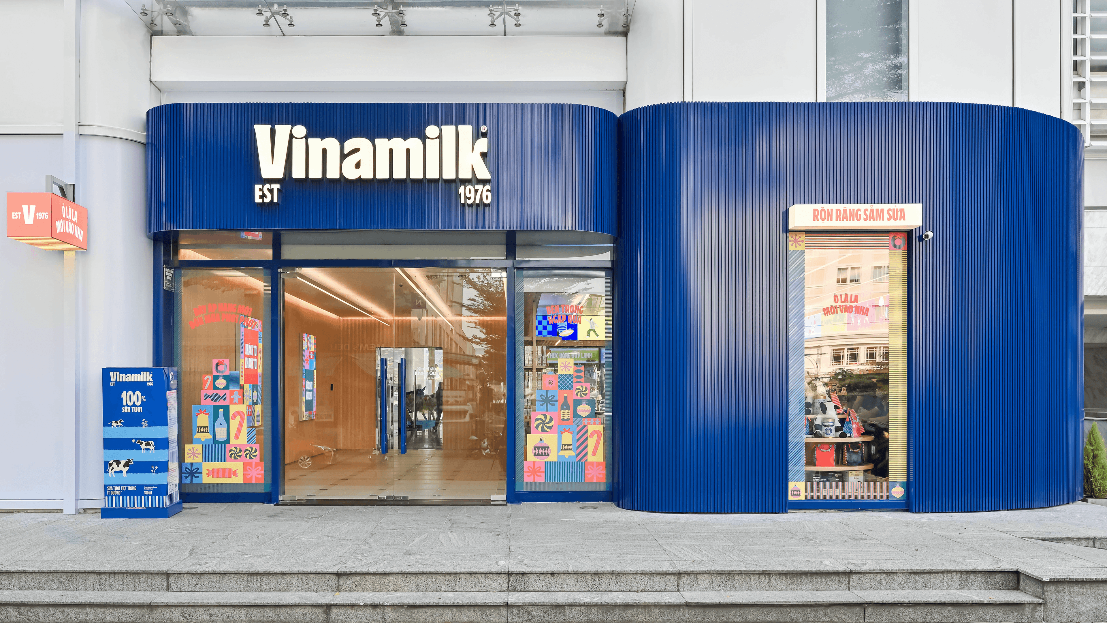
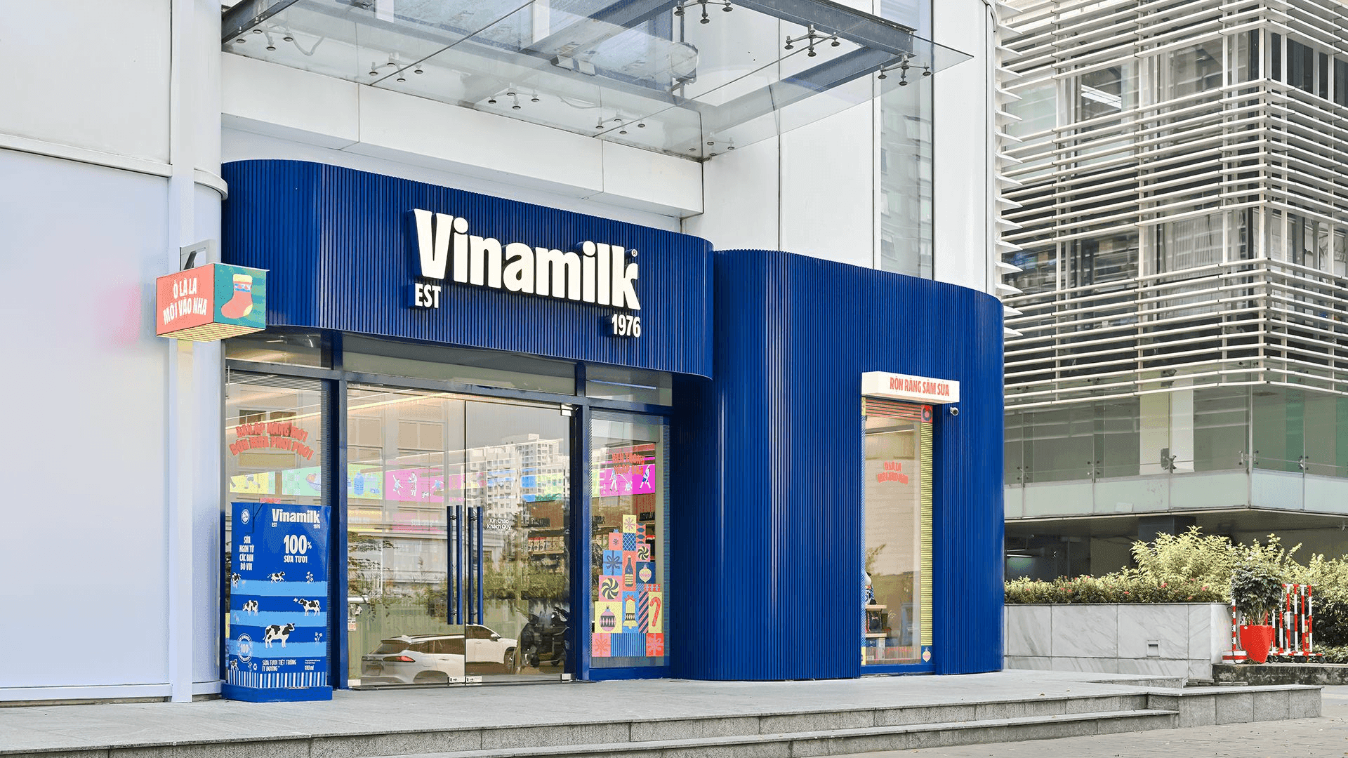
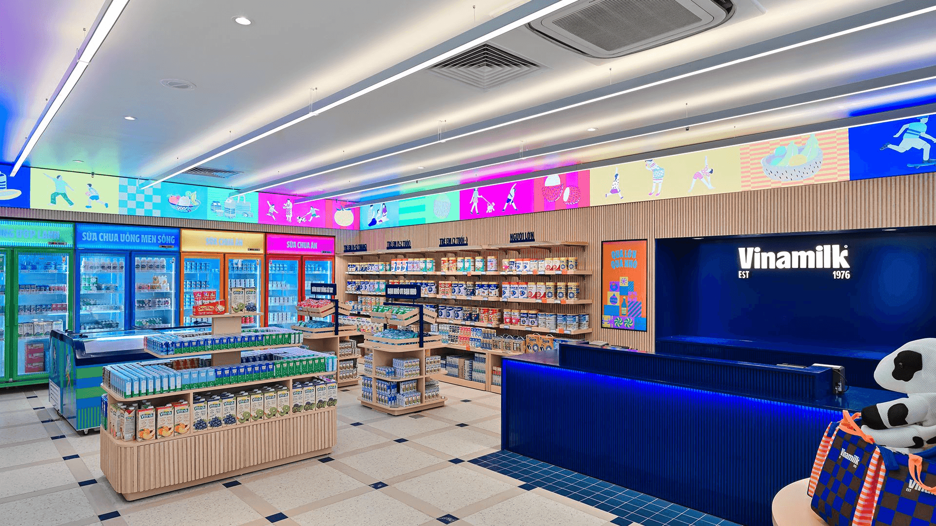
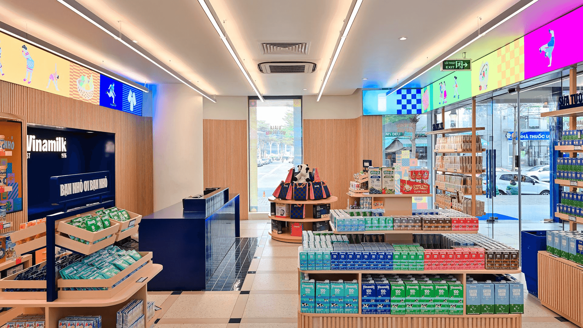
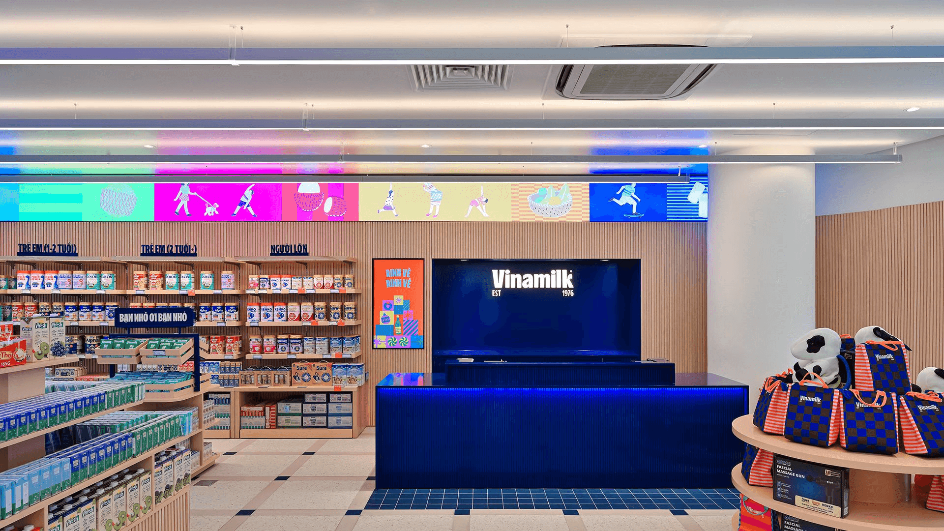
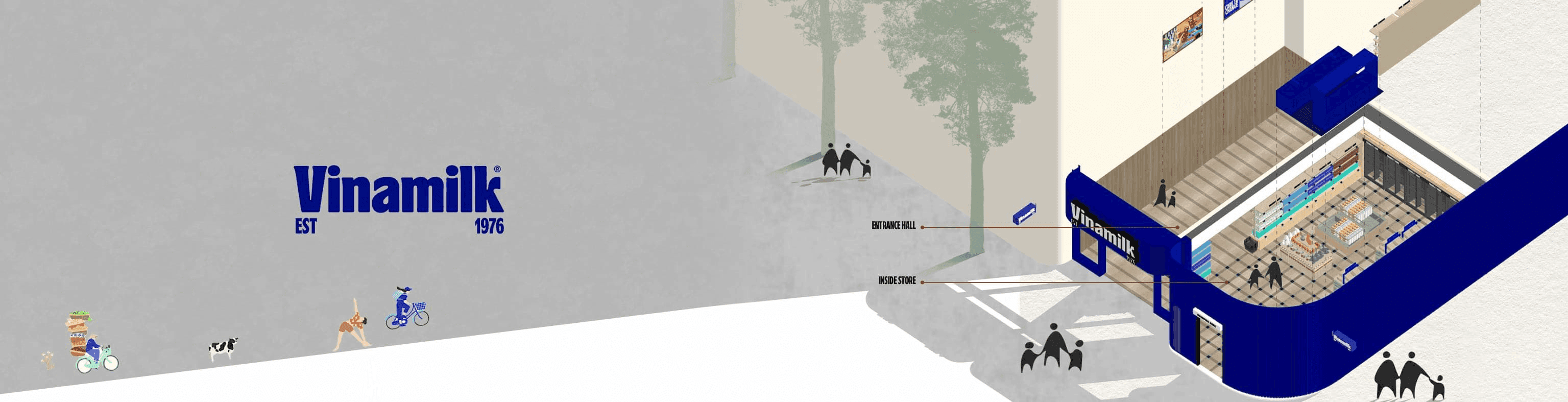
This Module K portfolio project uses Vinamilk blue as an architectural signal, framing entrances, circulation edges, and key touchpoints with a confident, highly visible identity.
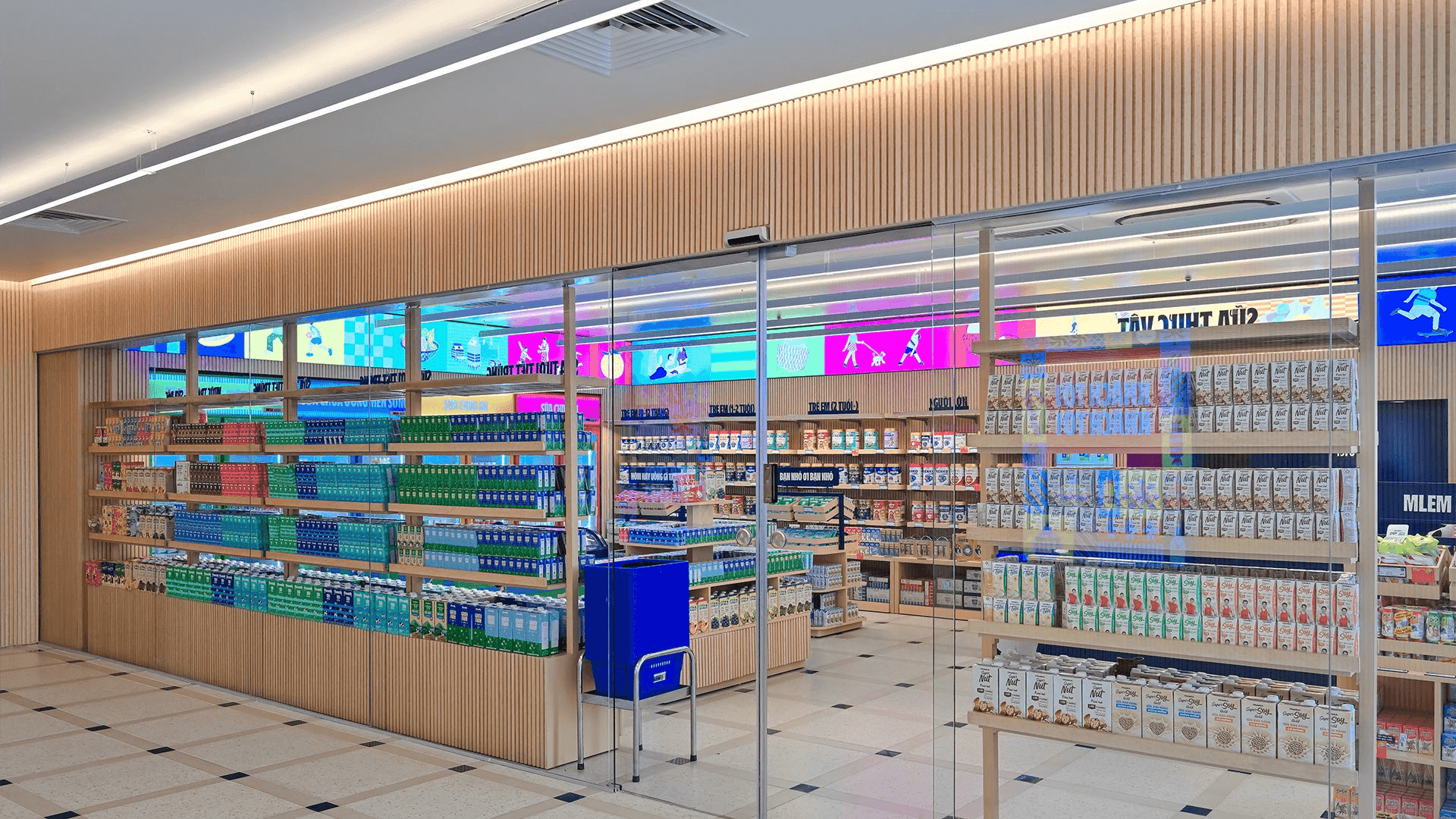
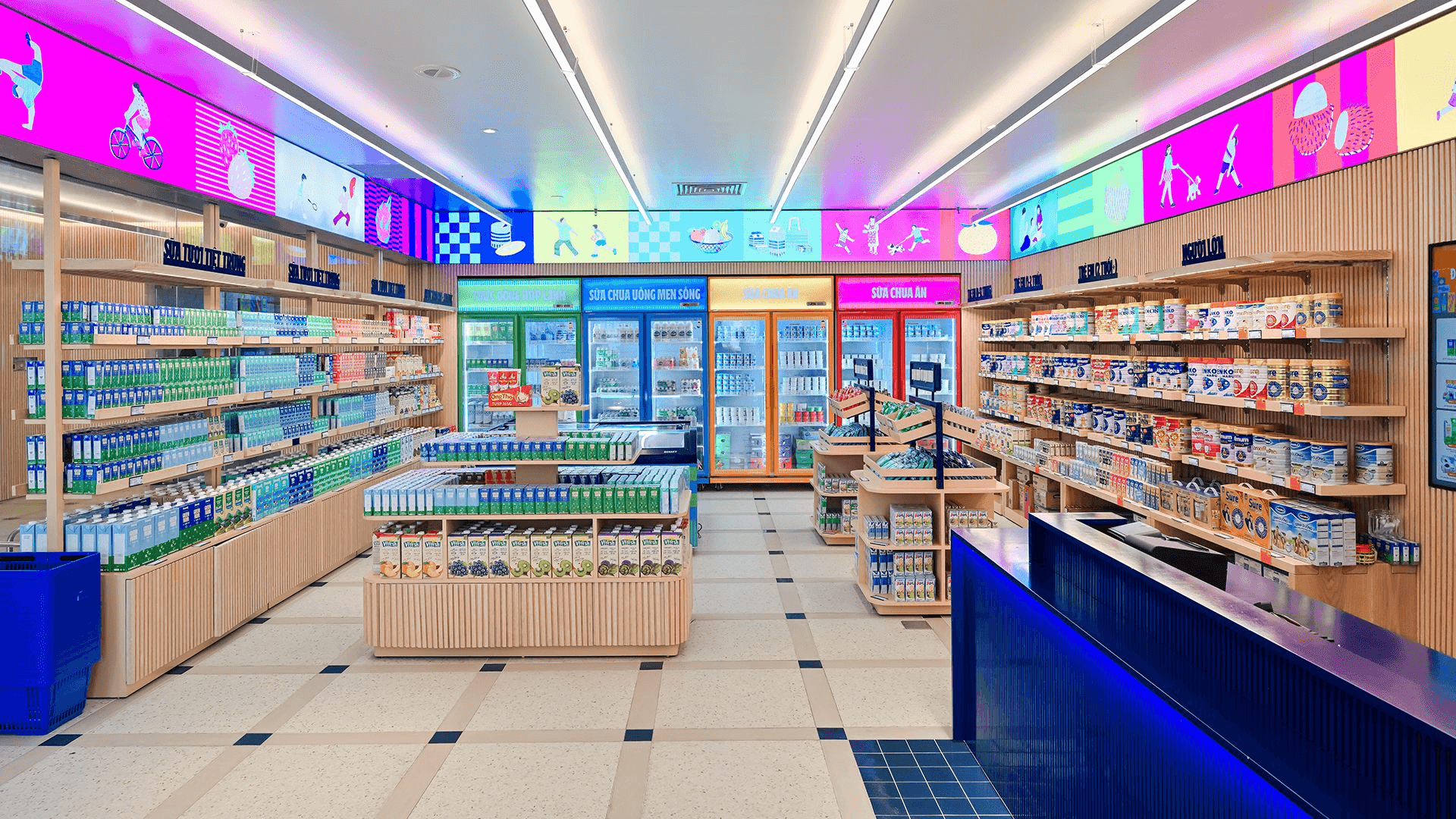
The planning language is open and legible, with product presentation and communication integrated into the customer journey. Warm timber, light surfaces, and simple family silhouettes soften the graphic strength.