Design Approach
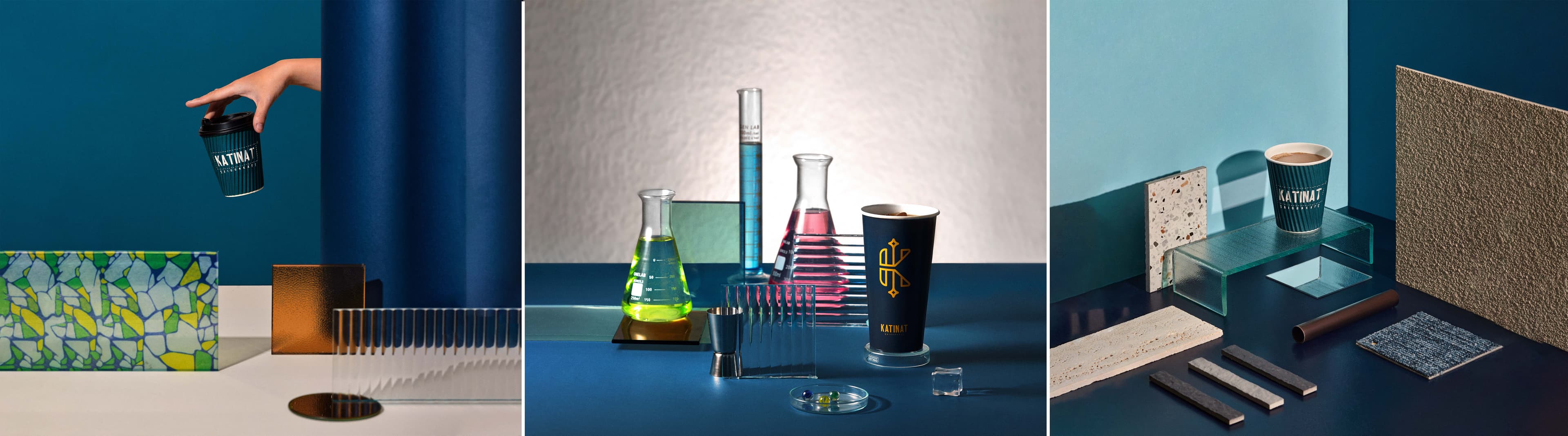
This Module K portfolio project builds a visual guideline from contrast: deep blue surfaces, vivid liquid colors, reflective glassware, and crisp golden marks. The imagery gives the brand a curious, experimental character.
Laboratory references make coffee feel like a crafted sensory ritual rather than a generic product. The system is designed to help spatial details, packaging, and communication share one recognizable visual voice.