Most people walk into a clinic already a little tense. Then the room confirms it: white walls, hard light, a counter that looks like a ticket office, equipment on show. A beauty clinic, a dental practice or a wellness centre that wants clients to return, and to recommend it, has to undo that feeling before the treatment even starts.
That is an interior design job as much as a medical one. Two projects featured in Dezeen this autumn show two very different ways to do it, and both are useful for the clinics, spas and beauty centres opening across Vietnam.
A clinic for teenagers that looks like a boutique
In Berlin, Batek Architekten designed Hey, an orthodontic clinic in a 178-square-metre former pharmacy. The brief came from the doctor, Julie Charlotte Angrick, who wanted a place where young patients would feel comfortable. Most of them are children and teenagers who come back regularly for years.
"We wanted to create a place that takes away the fear of the clinical environment without being childish," studio founder Patrick Batek told Dezeen. "Instead of colourful decoration, we chose radical reduction."
The clinic is almost monochrome. A soft pastel yellow runs from a resin floor up across the walls, paired with matt silver. A folded steel reception counter, a sculptural bench and a criss-cross coat rail give it character, and a few elements in red, such as room numbers, chairs and signs for the toothbrushing areas, match the sign in reception. Dezeen notes it could be mistaken for a fashion boutique or a gallery.
The calm is not decoration on top of a clinic. The architects cleared and rebuilt the plan to improve how patients move through it, used tiles on wet and frequently touched surfaces, and built cabinets into the walls so tools and equipment are hidden away. Even the name works on the same idea: "Hey" is meant as an informal welcome, and the graphic identity by Bailey und Bailey carries it through.
A wellness centre built from what was already there
In Fremantle, Australia, interior studio Rezen turned the former stable and cellar under a 1903 hotel into Alchemy Saunas. Instead of covering the old red brick and local limestone, the studio made them the focus and kept new additions in steel and tile "recessive" and "utilitarian".
What makes it work is how the plan matches each activity to the space. "Saunas don't require a great deal of height, so these and the washrooms are generally located where there is not much height or outlook," studio director Rhys Bowring told Dezeen. The communal bathing areas, an ice pool and a warm magnesium pool, sit in the double-height former stable under large arched windows. "It creates a variety of atmospheres between dark, heavily protected spaces and generous naturally lit areas."
What the two have in common
The clinic and the sauna look nothing alike, but they follow the same decisions:
- Start from how the client should feel, not from the equipment list. Hey began with a client who did not want young patients to be afraid. Every later choice, from the colour to the name, answers that one sentence.
- Use one strong idea instead of many decorations. One colour from floor to wall in Berlin; the original brick and stone in Fremantle. A single clear idea reads as confidence, which is what clients want from someone treating them.
- Hide the clinical, keep it hygienic. Built-in cabinets, easy-clean tiles where hands touch, a seamless floor. Clients should see care, not the machinery of it.
- Give each step of the visit its own atmosphere. Reception, consultation, treatment and rest are different moments. Rezen put the protected, low rooms where privacy matters and the light where people gather.
- Let the space and the brand speak with one voice. Hey's name, logo and red details are part of the same system as the room. That is what makes a clinic memorable enough to recommend.
Questions to ask before you brief a clinic or spa interior
- How do your clients feel when they arrive, and how do you want them to feel when they leave?
- Which equipment and supplies must be close at hand, and which can be hidden?
- Where do clients need privacy, and where can the space be open and bright?
- Which surfaces will be touched and cleaned many times a day?
- What one idea, colour or material should a client remember and associate with your name?
If you are planning several locations, the answers also become the base of a space guideline, so each new clinic feels consistent, not identical.
Where we see this at home
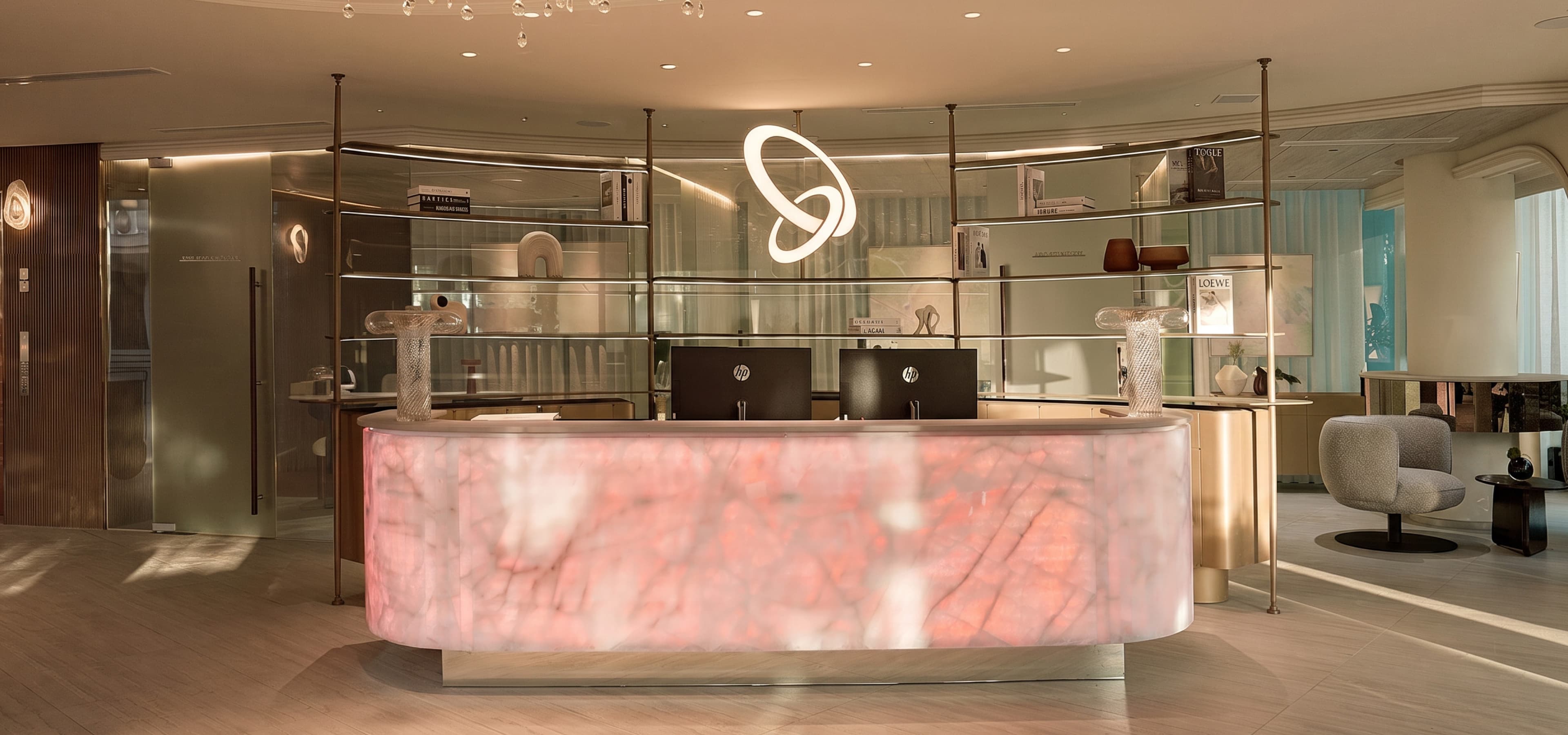
At Shynh Super Luxury in Thảo Điền, Module K designed and built a beauty and wellness destination where advanced technology sits inside a calm, private setting rather than a clinical one. Curved forms soften the move from reception to consultation, treatment and relaxation, while filtered daylight, layered lighting and glass-block screens give each zone its own atmosphere and balance openness with discretion.
At Module K, we work beyond spaces, building brand systems. If you are opening a clinic, a spa or a beauty centre, talk to us about the feeling your clients should take home.